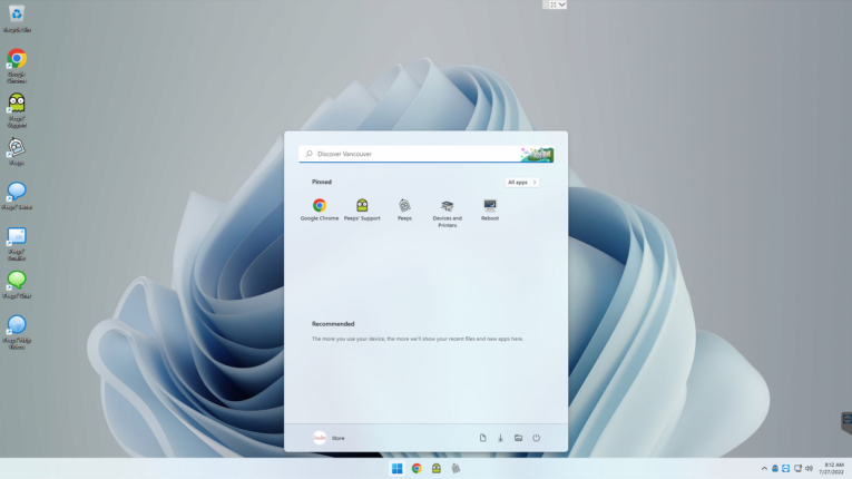
I think Windows 11 is finally getting the UI to a place that Microsoft has been competing with Apple against for decades. It’s still very Microsoft, but it’s nice to see the Windows UI not just changing to “try and look new/modern,” but to do that in a way that to me, actually looks like they’ve conceded and delivered a nice UX.
We still apply Peeps’ Configuration Protocol, as Windows 11 is still a bit messy out of the box + defaults to a lot of ‘nagging’ and ‘advertising’ features that do not belong on professional point of sale and inventory management systems.
One of the main takeaways for those using systems with Windows 11, is the moving of the long-standing, always-at-the-bottom-left-hand-corner Start Menu (what Apple users call the Apple Menu). In Windows 11, it’s centered now:
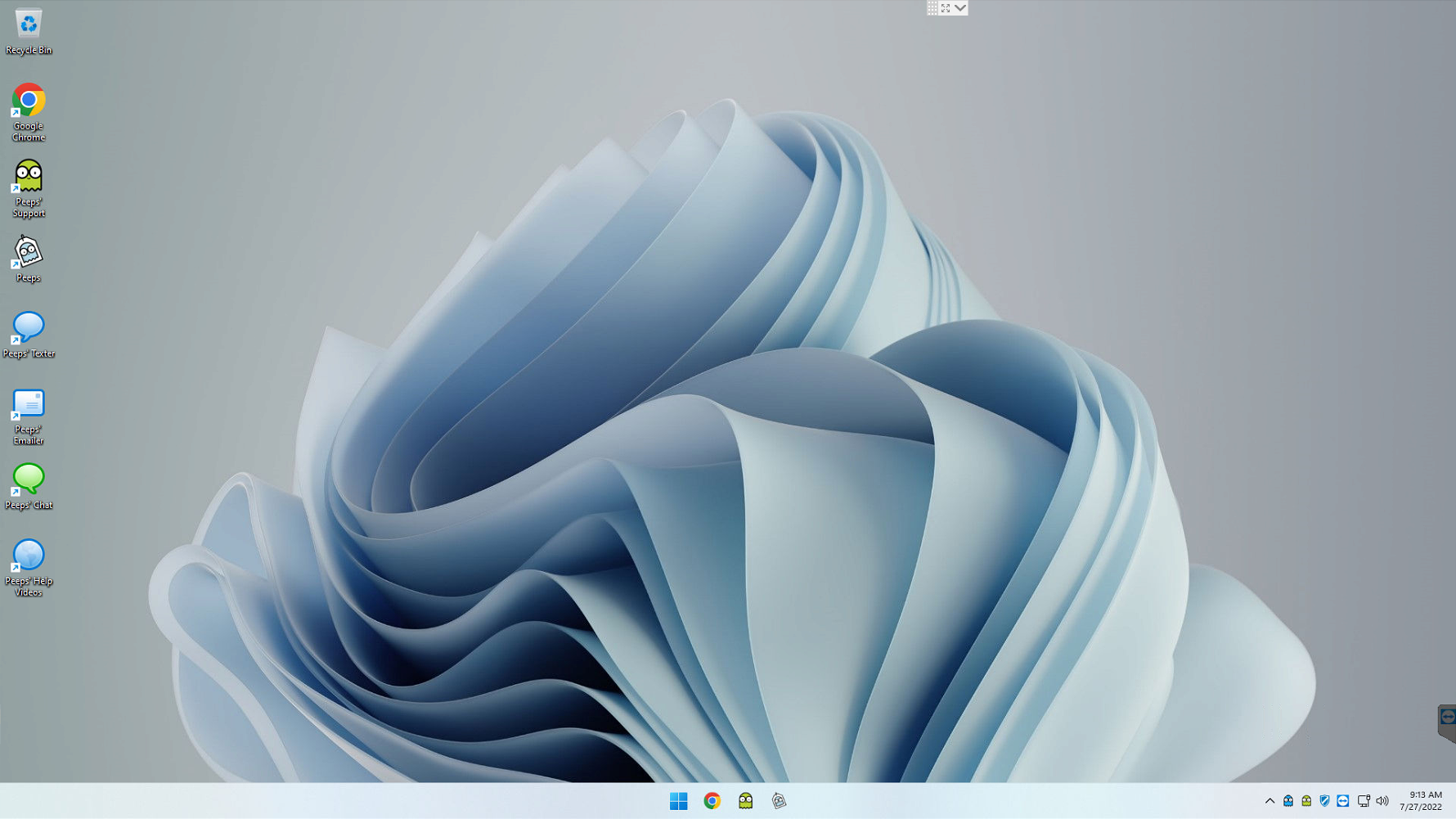
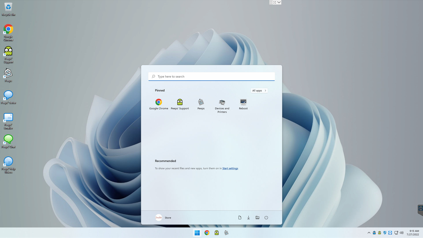
I’m ok with that and it’s fine if it’s biting Apple’s style, as this all came from the same place anyway.
And just to show Windows 11 vs. Windows 10, here’s a MiniPeep Touch running Windows 10:
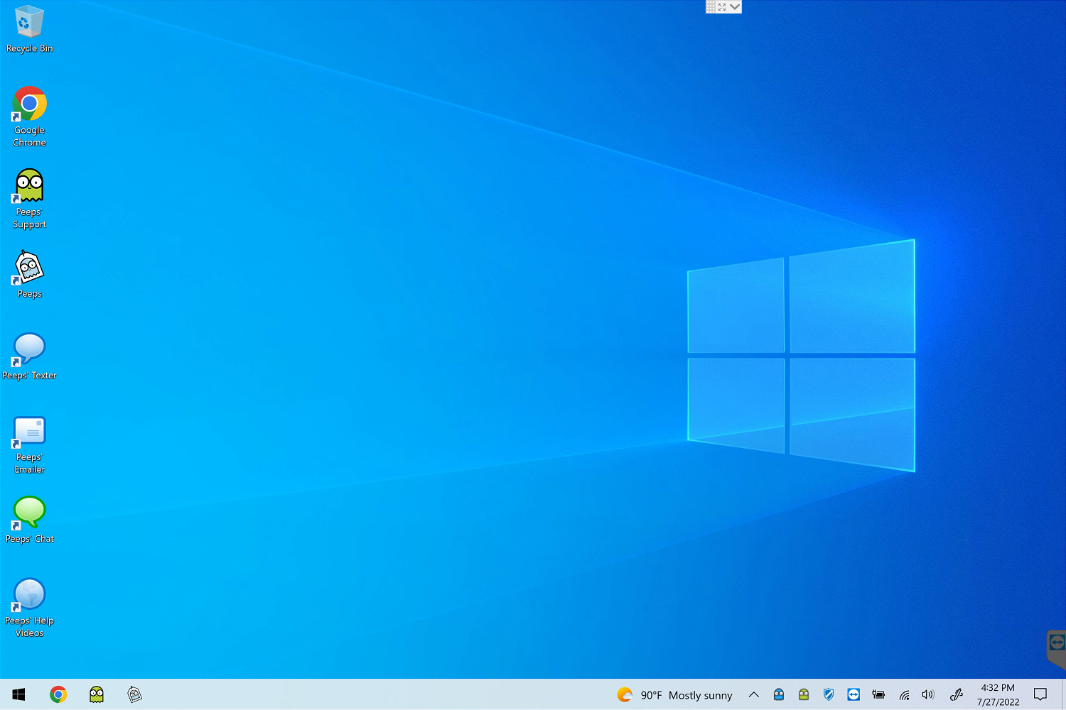
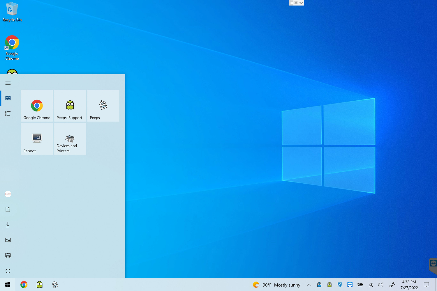
For those already not very comfortable with navigating computers and technology — and for systems in “high impact” areas, such as point of sale — both the software and the operating system itself, benefit from being clean and organized. Rather, the person working with the computer day in and day out, benefits from it being clean and organized.
I do think Windows 11 has helped temper the nerdiness associated with Windows/Microsoft and I see that as a benefit to storeowners running Windows 11.
Whether or not the technical issues that Windows 10 brought with it @ Windows Updates problems and Start Menu problems will persist, is to be seen.


